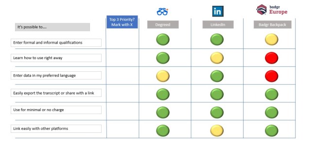
First version of the matrix for fully-sighted learners
This week’s assignment is to create an educational visual aid, incorporating aspects of good visual design. You can view my submission here.
I chose to refine a concept for my original signature assignment idea about lifelong digital transcripts. This would be an asset which is available for the student to download and print out once my video explains the different features of digital CVs. I used Microsoft PowerPoint to create this asset because I am comfortable with this tool and can compose documents easily with it.
The first matrix generally follows the example in the picture although I have also a set of written directions at the top. Once I evaluated it critically, I wanted to make it more obvious what the learner is meant to do without having to read the instructions, so I added the 1, 2, 3 and the arrows for the steps. I was going for clarity of what is expected from the learner and thought the red, yellow, green would be very obvious that these are “traffic light” ratings of that feature for that tool. I added texture to the traffic light ratings to make them more visually attractive.
Visual design elements: The first one leverages line, shape, colour, and texture.
Visual design principles: I believe I incorporated unity, balance, and similarity.
After completing the first matrix, I considered that colour-blind people would have difficulty distinguishing the red from the green buttons. I then added the black and white icons instead, with black equivalent to green and white equivalent to red. Is this obvious? Could I remove the instructions? PowerPoint also has an Accessibility check and it said my grey text boxes were difficult to read, so I changed them to black with white text for more contrast. The check also said I needed to add the ability to have the text boxes read out, although I’m not sure how well this would work when transferring over to pdf.
After showing this to some classmates I got feedback that they preferred the accessible version, but they didn’t understand what the circles meant. Also they didn’t find the column where you had to mark an X useful. My teacher said, “accessible design means it becomes better for everyone!” So here we have DigitalTranscriptComparisonMatrixV2.
We also have a requirement to evaluate our artifact using our digital media checklist. Please see here for my self-evaluation.

This matrix document is licensed under a Creative Commons Attribution-NonCommercial-ShareAlike 4.0 International License.

You must be logged in to post a comment.